Thursday, February 21, 2013
NFL Uni Review- The NFC North: Detroit Lions
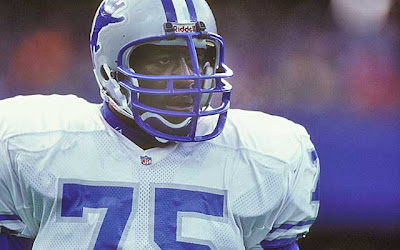
Another elite uni that was picked at and picked at and picked at until it became a joke. When this uni was at it's peak, it was a the Raiders of the NFC. Silver and Hawaiian blue vs. the silver and black of the Raiders. The lion logo on the helmet was simple and well designed and intimidating! There was no need to do the new update to the logo. When you take a great logo and do adjustments like the Lions did, you are saying you just handed this off to a designer who knows nothing about sports, let alone design. It's like when UPS "redesigned" their logo. They took a classic, well designed logo and ruined it. Just as the Vikings added black to the horn on the helmet to give the illusion of dimension, the lions added the cuts and detail so as to make it fiercer. IT WAS ALREADY FIERCE! Of course the first thing the Lions did was the cliche colored facemask and white cleats. Then they really lost their minds. They started to add black. First some black accents and then an all out black assault. Eventually they took away the great original stripes on the jersey sleeves and replaced them with a giant middle stripe and two thin ones (and of course they had to have black in there!). They added black to the stripes on the pants, outlined the logo on the helmet in black and worst of all, they slapped a black facemask on the helmet. And to top it all off, they abandoned the beautiful Hawaiian blue for a generic electric royal blue that looks like s#$t. This once proud uni is almost as bad as the Vikings' current uni. In fact, I'd have to say it's a tie between the two.
Sunday, February 17, 2013
NFL Uni Review- The NFC North: Green Bay Packers
Something to remember is that originally, every team in this division played outside, on real grass, and in the northern states. The weather was shitty! Heat and humidity in the early part of the season, then rain and then snow....wonderful! Grass stains, mud, blood and guts. It deserved it's name; the Black and Blue Division. Overall, the Black and Blue Division is now a complete joke in the uni department. Very sad because it was once the pride of the NFL.
Green Bay Packers
How do you make green and gold look good? You use a beautiful forest green and yellow that leans towards ochre. Again, this uniform was an elite uni. The grey facemask, the simple bold logo, the stripes on the socks and of course, black cleats and white laces. They still play in Lambeau, but other than that, all has been lost. The yellow is now so bright it hurts your eyes. The stripes on the pants are way to wide. They threw a green facemask on the helmet (of course). The took away the stripes on the socks. Went to white cleats in the 70's and then returned to "black" (you know, those ridiculous NIKE black and white combo things that are now the team colors if the player chooses to go that route). They took away the traditional old school sleeve stripes for some goofy looking 3 stripe pattern that looks terrible. And, lastly they threw a stripped neck boarder on the jersey. It looks like a ox yoke! AWFUL! They did keep the great wide, bold numbers (the Raiders are the other team that uses this version). Again, it was an elite uni, but like the Bears, it's now a sad watered down version of what was once a great uniform.
Subscribe to:
Comments (Atom)


