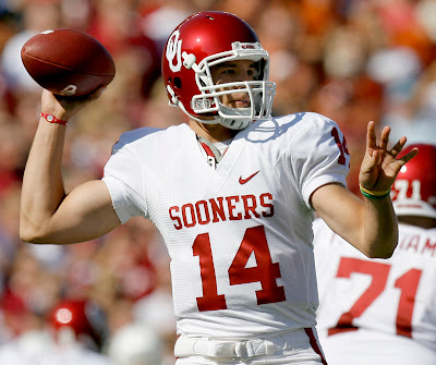
This one's pretty straight forward kids. Simple, clean and bold. Not overdone with some ugly logo like most college's do (ex. Boise State's old helmet, TCU) or over designed letter (Wisconsin). Not cheesy script lettering like Florida Gators and Ol' Miss do. If you're going to do script lettering, do it right like UCLA or Cal. STOP with the crazy gimmicks like Maryland's flag helmet or ND's half Golden Dome, half fighting leprechaun. If you are going to do a unique helmet, do it right like Oregon and Rutgers did. ALWAYS a grey facemask (Oregon gets the pass here. Hey, the designers at NIKE finally nailed this helmet). I can live with white if it's the right fit for a college team (ex. Oklahoma, Michigan State), but grey is never wrong. Numbers on the helmet are a big plus with me (Alabama, Georgia Southern, Penn State before they abandoned them). The elite college helmets: Notre Dame, Alabama, Ohio State, Texas, Kansas State, Oklahoma, Michigan State, USC, UCLA, Georgia Southern, Oregon. The really nice tier is Tennessee, Iowa, Michigan (sorry Wolverines, get back to the grey facemask and numbers on helmet like you did in the Sugar Bowl and your are back in the elite tier), Cal, Arkansas, Rutgers, Georgia, Syracuse, Texas A&M, Miami. And some honorable mentions: Purdue, Indiana, Colorado, Washington State and Penn State (go back to grey facemasks and numbers on the helmets Penn State. You finally went back to white laces, now finish the look!).
Thursday, November 29, 2012
The perfect (college) football helmet
This one's pretty straight forward kids. Simple, clean and bold. Not overdone with some ugly logo like most college's do (ex. Boise State's old helmet, TCU) or over designed letter (Wisconsin). Not cheesy script lettering like Florida Gators and Ol' Miss do. If you're going to do script lettering, do it right like UCLA or Cal. STOP with the crazy gimmicks like Maryland's flag helmet or ND's half Golden Dome, half fighting leprechaun. If you are going to do a unique helmet, do it right like Oregon and Rutgers did. ALWAYS a grey facemask (Oregon gets the pass here. Hey, the designers at NIKE finally nailed this helmet). I can live with white if it's the right fit for a college team (ex. Oklahoma, Michigan State), but grey is never wrong. Numbers on the helmet are a big plus with me (Alabama, Georgia Southern, Penn State before they abandoned them). The elite college helmets: Notre Dame, Alabama, Ohio State, Texas, Kansas State, Oklahoma, Michigan State, USC, UCLA, Georgia Southern, Oregon. The really nice tier is Tennessee, Iowa, Michigan (sorry Wolverines, get back to the grey facemask and numbers on helmet like you did in the Sugar Bowl and your are back in the elite tier), Cal, Arkansas, Rutgers, Georgia, Syracuse, Texas A&M, Miami. And some honorable mentions: Purdue, Indiana, Colorado, Washington State and Penn State (go back to grey facemasks and numbers on the helmets Penn State. You finally went back to white laces, now finish the look!).
Subscribe to:
Post Comments (Atom)


No comments:
Post a Comment